Data: When selected (the default), normal data values will be displayed in the custom field.
Graphical Indicators…: When selected, the Graphical Indicators command button brings up the Graphical Indicators dialog, where the user can specify a series of value tests and an image to display depending on which test the field contents matches. Up to 128 tests can be defined. The Graphical Indicators dialog is described in greater detail under “Defining Graphical Indicators” later in this lesson.
Graphical indicator information is retained with a custom field even if the indicators are later disabled. For example, if the user specifies a set of tests, values, and indicator images for a custom field and then changes the “Values to display” option to Data, the graphical indicators are no longer enabled, but the indicator criteria are retained if graphical indicators are re-enabled at a later time.
OK: Sets or modifies the customization of the selected field and closes the dialog.
Cancel: Cancels the dialog without setting or modifying the custom field.
The Value List command button in the Customize Fields dialog brings up the Value List dialog shown below, with the selected field name (or renamed alias) as part of the dialog title:
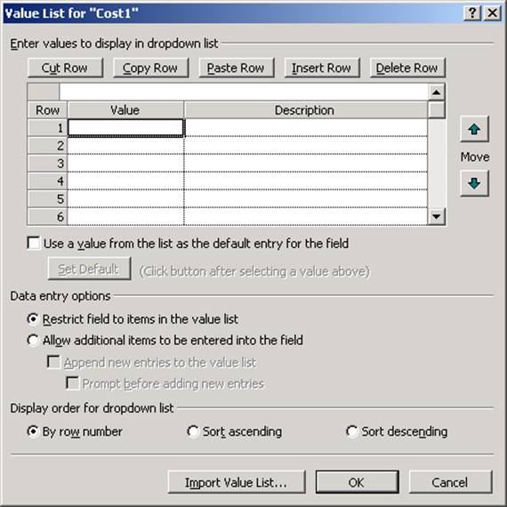
Figure 6 - Value List dialog
A description of each of the items in the dialog follows.
Cut/Copy/Paste/Insert/Delete Row: These buttons work in the same way as in other dialogs, such as the Edit Lookup Table dialog. Standard keyboard shortcuts can also be used.
Row/Value/Description grid: Up to 10,000 entries can be added.
Row: Read-only column that contains the row numbers in the grid. Row numbers are mainly for reference, and are only significant if the Display order is set to By Row Number. The user can change the order of items in the grid by inserting, deleting, or moving rows, but row numbers do not move with the items.
Value: Contains the actual strings that will appear in the field’s drop-down picklist and in the field once they are inserted. Can be up to 255 characters long. For date fields, the format for dates in the drop-down list cannot be modified and will always have a long date/time form similar to “Wed 12/15/99 8:00 AM,” as shown below (though once they are inserted into the column they take the default format as specified in Tools/Options or in the table definition).
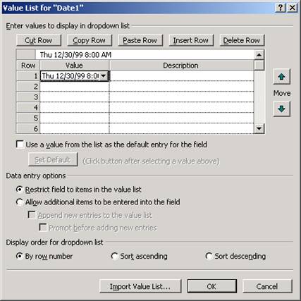
Figure 7 - Date Formats
Description: Contains optional descriptive strings, up to 255 characters long, that can be used to provide more information than is contained in the Value column. If used, they will be displayed to the right of their corresponding Values in the picklist, separated by a dash, as shown below. Once a Value is inserted, however, the description is not included with the Value text.
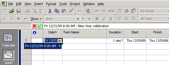
Figure 8 - Value List Description
Descriptions will also be used in the Name column of group header summary rows, if the custom field is one of the fields being grouped. If no description is present, then the Value will be displayed instead.
Values and Descriptions can each contain up to 255 characters, but in the picklist the visible portion of the combined Value and Description will be truncated to the width of the table column, or to a minimum width of about 20 characters if the column is very narrow.
Use a value from the list as the default entry for the field: When checked (the default is unchecked), specifies whether the custom field will have a specific default value rather than simply containing Microsoft Project’s default value for the field type (blank for text fields, N/A for date fields, $0.00 for cost fields, No for Boolean fields, etc.) when new tasks are added. When checked, the Set Default button is enabled so that the default value can be specified.
Уважаемый посетитель!
Чтобы распечатать файл, скачайте его (в формате Word).
Ссылка на скачивание - внизу страницы.